In a previous discussion, I highlighted the marketing mix concept, which essentially encompasses the factors under a marketing manager’s influence to boost sales or enhance market share. There are many levers that a manager can readily tweak, including pricing, promotion strategies, and product offerings. Understanding that marketers can pull these levers, we seek to develop models that help us better understand the optimal mix or balance of factors that drive the highest sales, market share, or profit.
Marketing Levers and Their Impact on Revenue
When we consider a brand, it’s helpful to understand that the levers mentioned above and the things they impact (revenue, profit, market share) form an interconnected system. If we can adequately model and describe this ecosystem, we can start to ask questions about the model. The most common is, “Which marketing channels are causing what impact on revenue?”.
To answer this question and others, we must first understand the causal effect of our levers on revenue. We must remember that correlation does not imply causation, and since we want to understand the cause, we must proceed cautiously.
One of the techniques we have at our disposal is causal graphs. A causal graph visually depicts the causal connections between different factors in a system. The graph’s structure reflects the assumed causal relationships, and understanding this structure is crucial for making valid causal inferences. Using causal graphs combines the left and right brain, the qualitative and the quantitative aspects of statistics. They are valuable tools that help us link our models to reality.
Causal Graphs
Graphs are powerful tools that allow us to show connections between different things, like cities or friends. Each thing is a point on the graph, called a node; the lines connecting them are the edges. These lines represent interactions. In graphs, we can have closed-loop cycles, like going from one city to another and back. Causal graphs must not have any cycles, a property called acyclic. Lastly, edges must only go in one direction (directed). As such, causal graphs are a particular type of graph called a directed acyclic graph (DAG).

We must draw a graph that reasonably represents the underlying causal mechanism. This step is the most important because the validity of the causal inferences depends on the accuracy of the assumed causal graph. If the causal graph misrepresents the actual causal structure, the conclusions drawn from the analysis may be inaccurate. Therefore, careful consideration and domain knowledge are required when constructing and interpreting causal graphs in the context of causal statistics.
One of the key benefits of starting with a causal graph is that we get to impart our own experience on our MMM. Many analysts believe that empirical evidence takes precedence over intuition. However, combining our empirical evidence with our intuition is necessary to form our causal graph and, like this, our MMM.
When deciding the components to include in our causal graph, we must have all the relevant variables. As such, when designing our graph, we have to strike a balance between complexity and simplicity. Incorporating too much or conflicting data in a causal graph poses risks such as misinterpretation, data quality issues, diminished model transparency, and increased sampling variability.
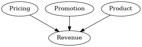
On the other hand, a causal graph that is overly simplistic may need more information to result in an adequate representation of the true relationships within the system. A graph that is too simple, as seen in Figure 2, fails to capture many underlying mechanisms due to the level of abstraction used, leading to deceptive insights and an incomplete understanding of the causal dynamics. This hinders the model’s effectiveness in accurately predicting and optimizing outcomes.
Striking a balance between simplicity and complexity, prioritizing data quality, and carefully selecting variables are crucial to addressing these challenges and ensuring accurate and meaningful causal relationships.

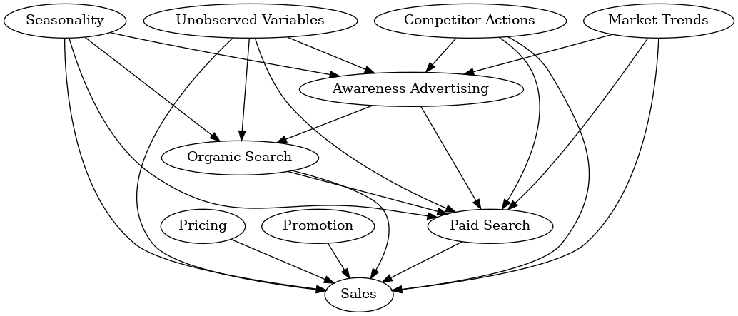
The graph in Figure 3 is much more complex than that in Figure 2 and prompts thoughtful considerations for MMM construction. For instance, it raises questions about the aggregation of all advertising channels. It challenges assumptions about the uniform functionality of various types of advertising, such as awareness advertising or paid search advertising. It is important to note that we can expand upon each graph that we design; for example, we can drill down into search advertising.

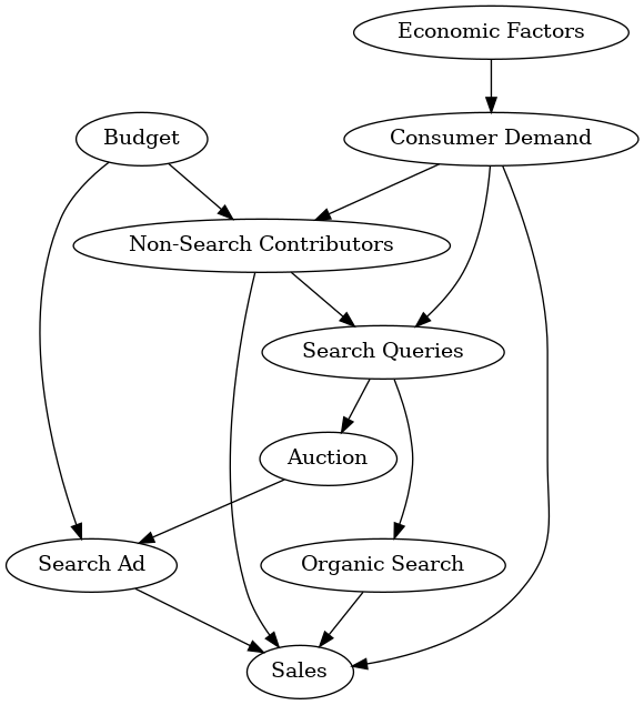
As seen in Figure 4, we see a complicated graph for a search ad illustrating the intricate relationships within this particular scenario. These detailed graphs empower MMM developers to tailor models to the nuances of each variable, fostering a more accurate representation of the underlying causal dynamics. Again, You could replace the organic search and paid search nodes in Figure 3 with the graph in Figure 4 if this is how the underlying system works.

Hopefully, through these examples, you will see how valuable causal graphs can be. Ideally, you now have an intuition for what causal graphs look like, how to construct them, and how they serve as a good starting point for any MMM.
Lastly, data scientists or analysts are the ones who build and deploy MMMs. Sadly, this typically happens with little to no input from marketers. By starting with a graph, we can bridge the gap between scientists and marketers, which facilitates buy-in and provides us with valuable information as we collect data. I recommend that all MMM builders draw this graph and solicit feedback and validation from your marketers and that all marketers ask their scientists for a representation of the graph.
Data Collection
When we build MMMs, we need data, but what data? And how much of it do we need? Another benefit of establishing the causal graph is that it tells us what data we need. We can also determine how far back we need to look by analyzing our causal graph with questions such as:
- Do we see more sales in summer than in winter?
- Do holidays impact our sales?
- Do we run promotions during holidays?
- Are there long-running underlying trends?
If we included these concepts in our causal graph, we would want years of data to model the effects accurately. We must have the data described by our causal graph, and if we are missing any of the variables we have determined are essential, we must go out and find it or provide appropriate proxies for any missing data.
Some rules of thumb from my own experience may be helpful. When measuring holidays, you can use at least two historical examples of them to build our holiday models. There are numerous ways to “learn” the impact of holidays, which I will dig into later, but having two examples of the same holiday works well for most models.
Additionally, understanding the temporal dynamics captured in our causal graph is crucial for determining the timeframe of our data requirements. For instance, if our graph reveals the influence of seasonality, we must consider whether sales variations occur during specific seasons. Assessing the impact of promotions during holidays requires data spanning multiple years to capture recurring patterns and isolate the particular effects of promotional activities.
By aligning our data needs with the insights derived from the causal graph, we ensure that our MMM is built on a robust foundation, facilitating accurate modeling and reliable predictions. I also mentioned that we sometimes need to find proxy variables.
Our causal graph in Figure 4 emphasizes the impact of economic factors on consumer demand, and historical financial data is limited; we could explore alternative economic indicators or indices that correlate with our primary variables. For example, the weather dramatically impacts consumer demand and supply in the fish market. If we build a causal graph for MMMs similar to Figure 4, we could use weather data as a potential proxy for consumer demand for a fish market.
Proxies are about creative problem-solving, relying on our understanding of the causal relationships outlined in the graph to identify alternative sources that can serve as adequate stand-ins. However, caution is essential, and it’s crucial to validate the reliability of proxies through empirical analysis and model performance assessment.
Measuring Impact
Now that we have established a causal graph and gathered the needed data, we can discuss the modeling portion of MMMs. In causal graphs, nodes are emblematic of variables, and edges establish direct causal connections between these variables. These edges symbolize the inherent influence that one variable wields over another. The question follows: how do we get the magnitude and direction of this influence?
The involvement of statistical or machine learning models becomes imperative when the aim is to measure or estimate the potency and characteristics of these causal relationships. We can leverage machine learning models to uncover the quantitative impact between nodes. For example, parameters intrinsic to a statistical model, like regression coefficients, are one way to measure this impact.
The choice of the model employed to estimate the impact within a causal graph holds paramount importance. We widely accept the assumption that advertising spending seldom exhibits a linear effect, and if it does linearly increase, it is only for a while. Therefore, adopting a linear model might lead to biased estimates, as it oversimplifies the intricate relationship between variables. In such cases, selecting a model that accounts for nonlinearities, like a saturation model, becomes crucial for a more accurate representation of the causal effects. The appropriateness of the chosen model profoundly influences the fidelity of the insights gleaned from the causal graph analysis.
To sum up our representation, nodes encapsulate variables, edges delineate causal ties, and the deployment of statistical or machine learning models serves as a pivotal mechanism for the quantification and examination of these relationships within the intricate framework of a causal graph.
Key Points:
- Using causal graphs provides a blueprint for the rest of the MMM design.
- Causal graphs allow data scientists and analysts to communicate effectively with marketers.
- Data availability can be an issue, but proxies exist to help with missing data.
- Machine learning models are the workhorses inside of a causal framework.
- Selecting appropriate models that deal with the nonlinearities in MMMs is essential.
Technical note:
I would like to make a technical point about causal graphs. I will do my best to avoid getting lost in jargon. Causal graphs are a construct suggested by Judea Pearl and his group at UCLA as part of a larger framework.
Pearl and his causal framework are more concerned with discrete models than continuous ones, and as we are looking at time series problems, they are inherently continuous. As such, we would have to represent a graph with a subscript and have precisely
such causal graphs. This is an issue, especially since, in MMMs, we know that spending today can impact revenue tomorrow.
I can easily posit a graph that aligns with marketing intuition, which will force a cycle, thus invalidating DAGs. Here, I use causal graphs to help the researcher better frame their problem and understand that the how is just as important as the why. For more information about this subject, check the references.
- The Book of Why, J. Pearl, and D. Mackenzie. Basic Books, New York, (2018)
- Gelman, A. (2009, July 5). Disputes about causal inference in the social sciences.
- Gelman, A. (2019, January 8). A review of the Book of Why by Pearl and Mackenzie.
- Angrist, J. D., Graddy, K. & Imbens, G. W. (2000). The interpretation of instrumental variables estimators in simultaneous equations models with an application to the demand for fish. The Review of Economic Studies, 67, 499–527.
- Chen et al (2018). Bias Correction for Paid Search in Media Mix Modeling.
All code can be found here.