Understanding the nuanced impact of shape effects is crucial as we delve deeper into Media Mix Modeling (MMMs). Shape effects refer to the varying patterns the relationship between marketing spend and revenue can take. Shape effects are one of the most critical parts of MMM design.
Shape effects are the primary mechanism through which we model what a channel or campaign has been doing and what it will do. If you read my previous article, this is the whole point of MMMs. If we can’t accurately represent how revenue responds to marketing spend (a response curve), we effectively can’t say what spend caused what revenue.
As I’ve mentioned, the first paper to illuminate how marketing spend and revenue relate believes that there is a non-linear relationship between the two. The authors of this paper described how, in their experiments, increasing spend had a decreasing impact on revenue. They referred to this shape effect as a saturating effect.
As one can imagine, marketing has changed since the 60s. One huge change we’ve seen is the creation of the internet, leading to e-commerce and online advertising. Most of my work has been in e-commerce, so I view these through that lens. What I find interesting is that almost all of the research on shape effects comes from brick-and-mortar retail studies.
With brick-and-mortar, the marketing response is almost always unobserved, so our hypothesis about the marketing response shape has always been difficult to empirically observe and prove. Luckily, in e-commerce, we have observed data about shape effects through ad platform data. Of course, the response data combines shape and carryover effects (and potentially other effects), but it’s not 1960 anymore. We can do better than just assuming what the shape of our data is.
Antiquated Shape Effects
Before discussing how we can identify shape effects through data, exploring and illustrating how modern marketing scientists view shape effects is useful. Most research in the area simplifies these shape effects into four different shapes: linear, concave, convex, or saturating (S-shaped):
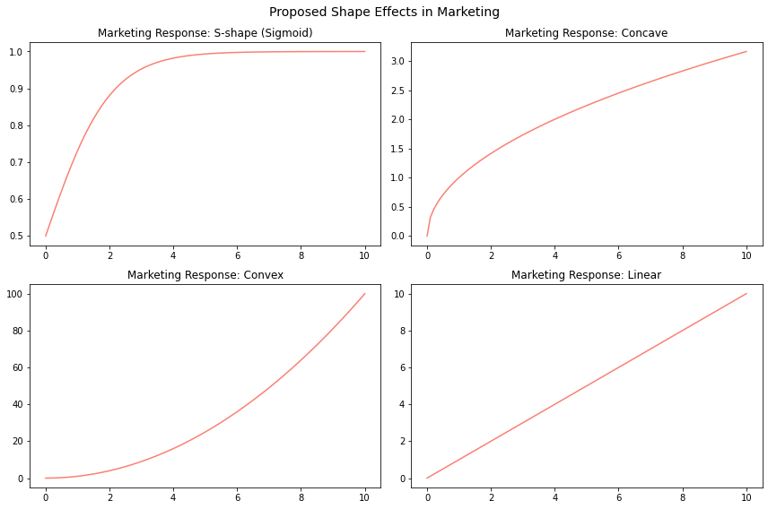
In Figure 1, we observe the four suggested shapes. Each shape offers unique insights into how sales respond to advertising expenditures.
- The convex shape suggests that sales increase at an accelerating rate. A convex shape could imply that at moderate advertising levels, the effectiveness of marketing efforts significantly amplifies. To most researchers, this seems implausible as one would increase spending dramatically towards infinity.
- The linear shape, depicted in the figure, just as the convex shapes, seems implausible because it implies that sales will perpetually increase up to infinity as advertising expenditure rises—a scenario that we believe doesn’t align with real-world dynamics.
- The concave shape is introduced to address the implausibility of the linear shape, capturing the idea that sales may increase but at a decreasing rate. However, when considering the limitations of this model, an S-shape emerges as the most plausible representation.
- The S-shape suggests that there might be little to no impact at very low advertising levels, possibly drowned out in the noise of other factors. Conversely, sales may stay relatively high at very high advertising levels due to market saturation or consumer fatigue.
Of these four shapes, it’s often asserted that the S-shape is the most plausible because we can’t spend infinitely and profit and, surely, we don’t get less revenue as we spend more, right? I’ll show later how this assumption frequently doesn’t hold.
The shape effect is an old idea upon which researchers still need to improve. This has to do with a combination of data limitations, technical limitations, and, sadly, complacency.
Data limitations:
When first trying to cover shape effects, researchers had to run massive tests to infer the marketing response. The data that came back was going to be inherently noisy. One way we deal with this noise is to aggregate the data. For example, if I aggregate daily data by week, month, or quarter, it will smooth it out quite a bit.
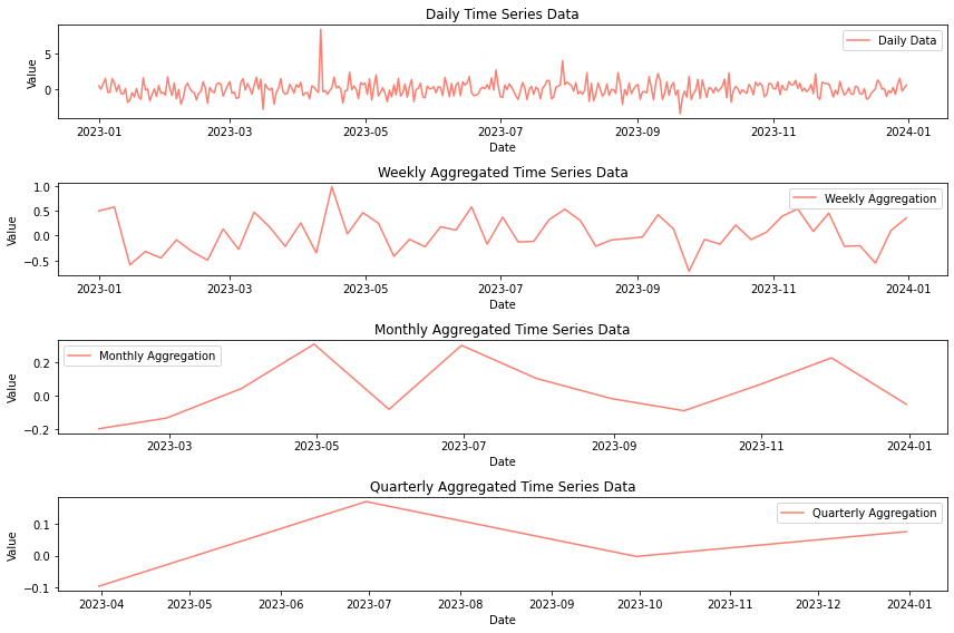
Notice how in Figure 2 I created a fake dataset with an outlier in April but that outlier all but disappears when we aggregate the data. Through this, we know that if we aggregate daily data we lose spikes. This could translate to missing the impact of pulsing marketing spend. This spike could be spend on events like Black Friday. So, by aggregating we are missing some of the most important events to a business.
In Figure 3, we can see yet another issue with aggregating data. The black line, which is an aggregation of the salmon, light gray, and teal lines, shows a clear saturating effect. But the campaign with the highest spend has a linear effect. This plot shows three theoretical campaigns, two of which have saturating effects and one that has a linear shape. I also included a fourth curve, which combines the three. Clearly, you can see that when we coalesce the responses, their sum is a curve that also saturates. This can happen if you aggregate campaign-level data at the channel level. Your one linear scaling campaign has scaling potential; if you keep spending on it, you can gain more revenue without sacrificing your return.
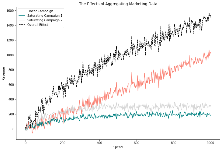
On the other hand, if we keep spending on the saturating campaign, we eat into our return. If we care about our return on ad spend (ROAS), we should reign in the spending on the saturating campaigns to the point where revenue starts to flatten out. If we aggregate these campaigns at the channel level and provide these insights to the marketer, the marketer could potentially waste money on the two saturating campaigns while spending less on the linearly scaling campaign that would make them money.
When choosing a function that approximates the shape of the spend, we prefer functions that can take numerous different shapes. An example of this: the Hill function, as seen in Figure 4.
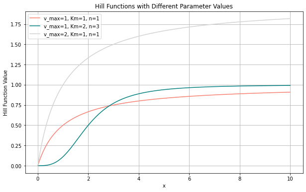
The Hill function is commonly used in MMM libraries, including Meta’s Robyn and Google’s LightweightMMM. It’s use in marketing was popularized by a research paper from Google. If we take marketing data and make scatter plots of how spending and revenue relate, we can see how well the Hill function approximates the actual shape of the response curve. The Hill function is a relatively robust function that can take multiple shapes depending on the parameters that are selected. This means that it has a higher chance of finding the correct shape compared to other, simpler saturating functions.
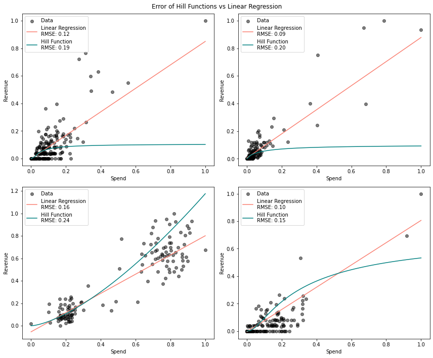
Figure 5 shows scatter plots of data that I took from 161 campaigns across Facebook, Adwords, TikTok, Twitter, and Bing. Of those 161 campaigns, linear regression fit the data better than the Hill function 77.6% of the time. Said another way, a simple line fit through the scatter plot did a better job of approximating the shape of the data than the Hill function.
To do this experiment, I took the 161 campaigns and sorted each one by its spend. After that, I split the campaign’s data in half. From this point, I learned the optimal parameters for the Hill function and linear regression. I took the learned parameters and predicted the revenue given the other half of the spend, which I held out. I avoided doing a traditional train test split with random shuffling because we care more about whether or not a marketer should scale a campaign than how our models handle a variety of disparate spends. If we cannot select a function that adequately extrapolates the shape of the data, we cannot, in good conscience, make a recommendation.
I calculated the root mean squared error based on the 50% of the data that was held out. In the plot above, I randomly selected the four campaigns to plot. The point I’m making is not that the Hill function is wrong or bad but that each campaign has a different shape and should be treated with the attention they deserve.
Each campaign in a marketing strategy could be within a different platform whose underlying mechanics work differently (i.e., Facebook vs. Google Search). Also, each campaign has a specific goal in mind known by the marketer. Certainly, they can’t all be expected to have the same shape. These facts, combined with the perils in aggregation exemplified by what we saw in Figure 3, show the importance of understanding the shape of each campaign and the risks if we do not. If we don’t know the correct shape of the data, our recommendations will be suboptimal.
Technical Limitations
Researchers have used the same antiquated shapes for decades, but this isn’t entirely their fault. From a technical perspective, there are two main reasons for this. One is related to computing power, and the other is the available math.
Before the 2000s, there was only a little computing power available to solve these types of equations, and we typically erred on the side of using simple, analytically solvable functions over complex, hard-to-solve ones. This is why the sigmoid is an obvious choice; it’s a function of one variable, which is easy to estimate. The Hill function, being a function of 3 variables, is more complicated and expressive—computationally more expensive but also solvable.
Another reason for simplifying shape effects was the lack of data from which to learn functions. As stated, more data was needed to observe these shape functions. From older studies, we see that researchers ran extensive tests across different geographies to observe how consumers would respond to changes in marketing interventions.
Thinking back to my earlier points, not only is the fidelity of this data in question, but it would also come back in hyper-aggregated forms in which, from my perspective, much of the marketing impact would be lost. With the effects lost, ascertaining the shape would be difficult or impossible. These days, we have the response data through multiple forms, including ad platforms, post-purchase surveys, and lift tests.
Indeed, there is some burden on the researchers who suggested these effects to attempt to prove that they exist, and indeed, there is some burden on those who continue to suggest that marketing must follow one of the four shapes already shown. However, as a reminder, this concept originated in the 60s when the searcher could only look at two (hopefully) correlated signals—marketing spend and revenue—and try to hypothesize the shape. Sadly, we still have this limitation when looking at retail data, as most of the response to marketing is latent. Still, we can use what we learn from e-commerce data to update how we think about shape effects for both retail and e-commerce. That point aside, there is another reason for these oversimplified shapes: we needed the computational power to solve more complex problems.
A Simple and Effective Solution
A simple yet effective approach to modeling shape effects is using splines. Splines offer a significant advantage over traditional linear or simplistic non-linear approaches by providing a flexible framework to capture complex, non-linear relationships between marketing spend and revenue. As I have shown, function-based approaches like the Hill function are not flexible enough to capture different shapes as spending changes. On the other hand, splines allow for varying rates of return, adapting to inflection points and saturation effects common in marketing dynamics. This flexibility enables marketers to predict and optimize the effectiveness of their spending across different channels and budgets more accurately.
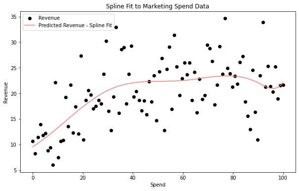
However, the use of splines comes with its own set of challenges and downsides. One of the primary issues is the selection of knot points, which can be somewhat subjective and may require domain expertise or iterative testing to optimize. To overcome this, we could specify knots utilizing techniques similar to Prophet’s automatic changepoint detection. Overfitting is another concern, as adding too many knots can make the model too sensitive to the data, capturing noise rather than the underlying relationship, which can lead to poor generalization of unseen data. We can mitigate these issues through sparse selection. Even though splines are much more flexible, they are no “free lunch,” and balancing the flexibility of splines with the need for model simplicity and interpretability is a critical consideration in their application in MMMs.
Wrapping it Up
The critical takeaway from delving into shape effects in MMMs is the recognition that a one-size-fits-all approach may lead to suboptimal results. The assumption that all marketing follows a universal family of shapes oversimplifies marketing dynamics’ nuanced and diverse nature. In data science, a foundational principle is to comprehend the intricacies of the data before model selection. This rule strongly applies when building MMMs.
The pitfalls of assuming homogeneity in marketing responses underscore the importance of a tailored and data-driven approach. Analysts are advised to exercise caution when considering off-the-shelf MMMs, as these models are often built on assumptions that might not align with the unique characteristics of a company’s marketing landscape. Adopting such generic models could result in inadequate recommendations and flawed insights.
Therefore, the call to action is clear: analysts should prioritize a thorough understanding of their specific data and choose model functions that capture the actual shape of their marketing-response curves. This approach ensures that MMMs are not just theoretical frameworks but practical tools that empower analysts to make informed and accurate recommendations tailored to the distinctive attributes of their company’s marketing strategies.
References:
- Vidale, Marcelle L., and HB88402 Wolfe. “An operations-research study of sales response to advertising.” Operations research 5.3 (1957): 370-381.
- Tellis, G.J. (2006). Modeling Marketing Mix.
- Jin, Y., Wang, Y., Sun, Y., Chan, D., & Koehler, J. (2017). Bayesian methods for media mix modeling with carryover and shape effects.
- Hill, A. V. (1910). The possible effects of the aggregation of the molecules of haemoglobin on its dissociation curves. Journal of Physiology, 40 (suppl), iv–vii. doi:10.1113/jphysiol.1910. sp001386
All code can be found here.